Ever stared at a blank wall and felt a pang of frustration? You’re not alone. Creating the perfect gallery wall designs can feel overwhelming.
I mean, where do you even start? With so many choices and styles, it’s easy to get lost. I’ve been there, desperately wanting to transform my space but unsure how.
But here’s the kicker: it doesn’t have to be complicated.
Why trust me? I’ve spent years diving into interior design, and I’ve learned what works. You’re probably wondering, what makes a successful gallery wall?
Is it the colors, the frames, or the layout? The answer is simpler than you think and that’s what this article will uncover. We’ll break down the process step-by-step, making your wall not just a display, but a conversation starter.
By the end, you’ll have a solid plan and the confidence to create a gallery wall that screams ‘you’. Ready to dive in? Let’s make it happen.
Planning Your Gallery Wall: The Pre-Arrangement Checklist
Before you even think about picking a hammer, you need a plan. Seriously, great gallery wall designs start long before the first nail hits the wall.
First, measure your wall space accurately. Sounds simple, right? But it’s easy to screw up.
Find the wall’s “visual center.” your eyes naturally rest when you first look at the wall. This spot is your anchor, so get it right.
Next, choose a theme or color palette. Cohesion is key. Whether it’s through color, subject matter, or frame style, your wall should tell a story.
Pick pieces that speak to each other. A jarring mix just looks like a garage sale.
Mix up sizes and orientations for visual interest. Vertical and horizontal pieces can complement each other beautifully. Variety keeps things exciting.
Here’s a practical tip: lay out your arrangement on the floor first. Or, use paper cutouts on the wall to visualize spacing before making any holes. It saves you from a wall full of unwanted holes.
For those in tight spaces, check out new layout ideas small homes. It offers clever ways to maximize your space. Remember, planning is everything.
The Art of Arrangement: Timeless Wall Layouts
Let me tell you, these classic wall art layouts are like your go-to black dress. They never fail. First up, The Grid.
It’s a symmetrical, organized layout. This works best when you’ve got pieces of the same size and frame style. (Think modern and clean.) If you want that polished, almost gallery-like feel, this is your layout.
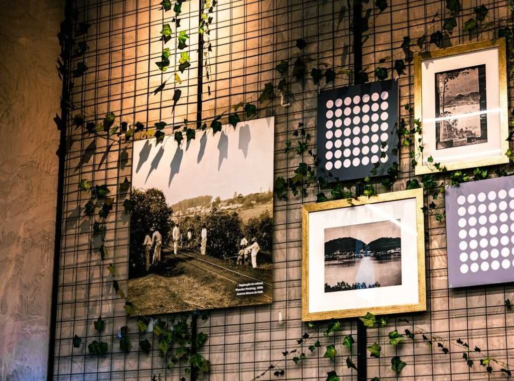
Now, let’s talk about the Salon Wall, or as some call it, the gallery wall. It’s eclectic and asymmetrical, perfect for mixing sizes and frame styles. Start with a central “anchor” piece and build outwards.
You know what I mean, right? That one bold piece that just pulls everything together. Gallery wall designs are all about personality.
Then there’s The Triptych. It’s a series of three panels that create a solid, panoramic effect. Best used for large spaces or above a sofa.
You want drama? This is it. The impact is huge, like a scene from a movie sprawling across your wall.
Next, consider the Single Statement Piece. Sometimes one big, bold piece says more than a collection ever could. It’s about creating a strong focal point, especially in a minimalist space.
Less is more here. You want that piece to shout (not literally) its presence in the room.
Finally, there’s The Linear Arrangement. Hang your art in a single horizontal or vertical line. It draws the eye through a space, like a hallway or a long wall.
It’s subtle but effective. If you want a layout that gently guides attention, this is your move.
If you’re looking to explore more, you might want to browse for inspiration. Trust me, once you find what clicks, there’s no going back.
Art Arrangement Challenges: Tackling Tricky Spaces
Ever tried hanging art on non-standard walls? It’s a headache, right? Let’s dive into some solutions.
Above a sofa or headboard, art should be about two-thirds the width of the furniture. This keeps it balanced, not overwhelming. Leave six to eight inches of space above to create a clean line.
It makes the room feel open without clutter. On a staircase wall, the diagonal arrangement works best. Use the “step” method to align each piece with a specific step.
It’s like playing connect-the-dots (but with art).
Now, let’s tackle the narrow hallway. A linear arrangement or vertically stacked pieces are smart choices here. Why?
They avoid clutter and keep the space feeling airy. Reflective frames can also help create a sense of openness. In the kitchen or bathroom, think carefully about humidity and heat.
Choose prints in sealed frames or canvas art that can handle the environment. You don’t want your gallery wall designs warping after a few steamy showers.
Speaking of design, consider balancing color space design to boost your arrangements. Choosing the right colors can transform an ordinary space into something special. It’s all about making your art pop without overpowering the room.
Art isn’t just about aesthetics; it’s about making a space yours. Have you ever seen a room transformed by a single piece of art? It’s like magic.
Remember, art is personal. You’re the curator of your space. So hang it in a way that feels right to you.
Beyond the Basics: Personalizing Your Art Display
Creating a gallery wall isn’t about copying a magazine spread. It’s about making it personal. Why settle for just paintings when you can mix in photographs, prints, and even those funky three-dimensional objects?

Small shelves, mirrors, or woven textiles can add depth and character to your space. Trust me, when it comes to gallery wall designs, the magic is in the mix.
Frames tell their own story. You don’t need to stick to one style. Mix things up but keep a consistent color palette.
Maybe all black frames? Or try all wood tones. Metallic finishes can add a sleek touch too.
This way, you create a cohesive look even with eclectic pieces. It’s like organized chaos (in the best way).
Think of your arrangement as a visual story. Photos from that unforgettable road trip? Pair them with art reflecting your hobbies or passions.
This isn’t just decoration; it’s your story on a wall. It’s your life, your adventures, your loves.
Now, let’s talk about ledges. Forget about the commitment of nails. A picture ledge offers flexibility.
Maybe I’m biased, but gallery walls should be as unique as you are. Does it all come together perfectly every time? Honestly, I’m not sure, but that’s the fun part.
You can easily swap and layer art pieces without any hassle. Plus, it lets you experiment. Who doesn’t love a good experiment?
It’s personal, it’s evolving, and it’s yours. That’s what makes it special.
Art Arrangement Blunders: Don’t Make These
Hanging art too high is like wearing your pants at your armpits (just) don’t do it. Follow the gallery rule: keep the center at 57-60 inches from the floor. Does it really matter?
Yes. Looking up to view art is a neck workout, not a pleasure.
Poor spacing is another killer. Keep pieces 2-4 inches apart. Otherwise, it looks like your wall’s got commitment issues.
And scale? Art that’s too small for a big wall looks like a lost puppy. Either go big or cluster smaller pieces for impact.
This is how gallery wall designs should be done.
Transform Your Space Today
Blank walls can be daunting, right? But now, armed with these simple rules, you’ve got a plan. Don’t let them intimidate you any longer.
Choose one wall, pick your favorite gallery wall designs, and start planning your new display now. Your perfect home awaits. Dive in and transform it today.

 There is a specific skill involved in explaining something clearly — one that is completely separate from actually knowing the subject. Charlesie Stonechoz has both. They has spent years working with interior design inspirations and layouts in a hands-on capacity, and an equal amount of time figuring out how to translate that experience into writing that people with different backgrounds can actually absorb and use.
Charlesie tends to approach complex subjects — Interior Design Inspirations and Layouts, Highlight Hub, Curious Insights being good examples — by starting with what the reader already knows, then building outward from there rather than dropping them in the deep end. It sounds like a small thing. In practice it makes a significant difference in whether someone finishes the article or abandons it halfway through. They is also good at knowing when to stop — a surprisingly underrated skill. Some writers bury useful information under so many caveats and qualifications that the point disappears. Charlesie knows where the point is and gets there without too many detours.
The practical effect of all this is that people who read Charlesie's work tend to come away actually capable of doing something with it. Not just vaguely informed — actually capable. For a writer working in interior design inspirations and layouts, that is probably the best possible outcome, and it's the standard Charlesie holds they's own work to.
There is a specific skill involved in explaining something clearly — one that is completely separate from actually knowing the subject. Charlesie Stonechoz has both. They has spent years working with interior design inspirations and layouts in a hands-on capacity, and an equal amount of time figuring out how to translate that experience into writing that people with different backgrounds can actually absorb and use.
Charlesie tends to approach complex subjects — Interior Design Inspirations and Layouts, Highlight Hub, Curious Insights being good examples — by starting with what the reader already knows, then building outward from there rather than dropping them in the deep end. It sounds like a small thing. In practice it makes a significant difference in whether someone finishes the article or abandons it halfway through. They is also good at knowing when to stop — a surprisingly underrated skill. Some writers bury useful information under so many caveats and qualifications that the point disappears. Charlesie knows where the point is and gets there without too many detours.
The practical effect of all this is that people who read Charlesie's work tend to come away actually capable of doing something with it. Not just vaguely informed — actually capable. For a writer working in interior design inspirations and layouts, that is probably the best possible outcome, and it's the standard Charlesie holds they's own work to.