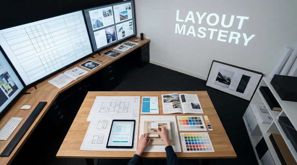
If you’ve been searching for practical, stylish guidance on creating a gallery wall, you’re likely looking for more than just inspiration—you want a clear plan that actually works in your space. Whether you’re styling a cozy apartment, refreshing a blank hallway, or adding personality to your living room, this article is designed to walk you through every essential step with confidence.
We break down layout strategies, frame selection, spacing techniques, and art pairing ideas so you can avoid common mistakes and achieve a balanced, cohesive look. Instead of vague design advice, you’ll find actionable tips rooted in proven interior styling principles and real-world space planning techniques used by design professionals.
By the end, you’ll understand how to choose the right arrangement for your wall size, mix textures and finishes thoughtfully, and create a display that feels curated rather than cluttered. If your goal is a gallery wall that feels intentional, personal, and polished, you’re in the right place.
From Blank Space to Statement Piece: The Art of the Gallery Wall
Staring at a blank wall can feel paralyzing. However, research from the Journal of Environmental Psychology shows personalized décor increases feelings of comfort and identity in a space (2015). That’s why creating a gallery wall works—it turns emptiness into expression.
First, define a focal point—the visual anchor that draws the eye. Then, lay frames on the floor to test spacing; designers call this a mock layout. According to Houzz surveys, 58% of homeowners plan layouts before hanging to avoid clutter.
Finally, hang from the center outward for balance. The result feels curated, not chaotic. It instantly elevates any room beautifully.
Step 1: Curate Your Collection and Define Your Space
Before you hang a single nail, pause. The secret to creating a gallery wall that feels intentional—not chaotic—is curation. Start by gathering artwork, photos, prints, or objects that share a common thread. A theme could be coastal landscapes, black-and-white photography, or even concert posters (yes, your Taylor Swift era counts). A color palette simply means a set of repeating colors that visually tie pieces together. Personal meaning works just as well—family memories, travel finds, or heirlooms often create the strongest cohesion.
The Frame Game
Next, think frames. A uniform look—like all black or natural wood—creates structure and calm. On the other hand, an eclectic mix of metals, woods, and bold colors adds personality (think “Friends” apartment energy). Frames act as a unifying element, meaning they visually connect different pieces. Pro tip: lay everything on the floor first and experiment before committing to holes in the wall.
Finally, measure your wall space carefully. Use a tape measure to define width and height, then account for nearby furniture. Leave 6–12 inches above a sofa or console table for balance. Also, maintain “breathing room,” or empty space around the arrangement, so the display doesn’t feel cramped. Thoughtful spacing makes all the difference.
Step 2: Master the Layout Before Making a Mark
Before you even think about nails or hooks, pause. Layout is the blueprint of your wall. In other words, it’s the difference between a polished display and a patchwork mistake you’ll keep “meaning to fix.”
The Floor Plan Method
First, try the Floor Plan Method. This simply means arranging your framed pieces on the floor before hanging anything. Think of it as a rehearsal. By placing frames on the ground, you can shift spacing, swap positions, and test balance without committing to holes in the wall. It’s especially helpful when creating a gallery wall because proportion (how size relates to surrounding pieces) becomes easier to judge from above.
Some people argue this step is unnecessary and prefer to “eyeball it” directly on the wall. While that might work for minimal setups, most walls benefit from pre-planning. A few extra minutes on the floor can save hours of patchwork later.
Popular Layout Styles
Next, choose a structure:
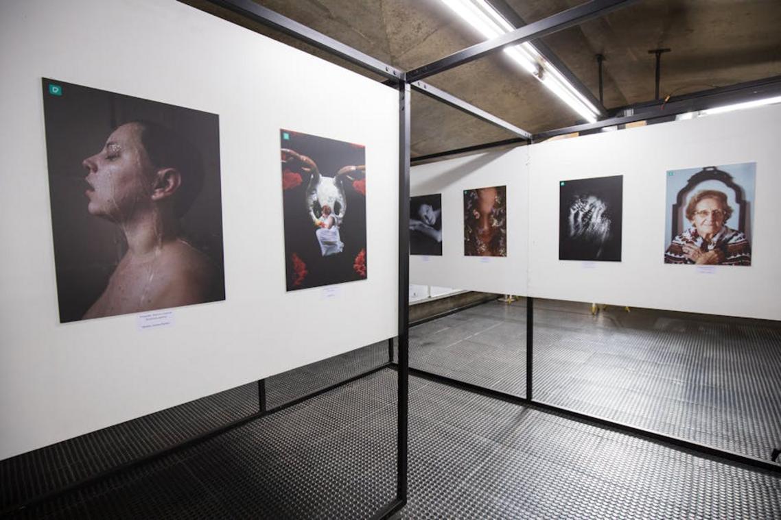
- The Grid: Symmetrical and modern. Frames are evenly spaced and usually the same size. Clean lines create visual harmony (very museum-inspired).
- The Salon Style (Asymmetrical): A curated mix of sizes and shapes arranged organically. Despite the name, it still requires balance—just less rigidity.
- The Centerline: All pieces align along a shared horizontal or vertical axis. This invisible guide keeps things orderly.
If you’re unsure which fits your taste, explore how to discover your unique home decor style (https://llbloghome.com.co/how-to-discover-your-unique-home-decor-style/).
The Paper Template Trick
Finally, trace each frame onto kraft paper, cut it out, and tape the templates up with painter’s tape. This mock-up lets you preview spacing precisely. Pro tip: mark hanger spots on the paper so nail placement is foolproof.
Step 3: The Art of Hanging for a Flawless Finish
I once thought hanging frames was the “easy part.” Then I stepped back and saw a crooked lineup that looked like it was sliding downhill (not the vibe I was going for). That’s when I learned: the magic is in the method.
Tools of the Trade
Before you lift a hammer, gather your essentials:
- Hammer
- Nails or sturdy hooks
- A level (laser or traditional)
- Measuring tape
- Pencil
Pro tip: A laser level saves serious time if you’re hanging multiple pieces along one line.
Finding the Anchor Piece
When creating a gallery wall, always hang the largest or most central piece first. Think of it as the “lead actor” of your wall. Everything else supports it. I usually position mine at eye level—about 57–60 inches from the floor to the center—since that’s standard gallery height (widely used in museums).
Spacing Is Everything
Keep frames about 2–3 inches apart. Closer feels intentional; wider can look disconnected. I’ve tried “eyeballing it” before. Regret followed.
Mark and Hang
With paper templates taped up, mark the nail spot for each frame directly on the wall. Remove the paper, hammer in nails, then hang. Step back. Adjust. Admire.
Elevate Your Display: Pro Tips for a Polished Look
Great walls tell stories. If you’re creating a gallery wall, start by mixing your media. Pair framed photographs with art prints, small paintings, and even 3D elements like decorative plates or slim mirrors. This layering adds depth (think museum meets cozy apartment) and keeps the eye moving.
Consider picture ledges for flexibility. They’re ideal for renters or anyone who rearranges often. Simply lean frames against the wall and overlap sizes for a relaxed, designer look. Pro tip: keep larger pieces in the back and smaller ones in front to avoid visual clutter.
Lighting is the quiet hero. Install a slim picture light above a favorite piece or use adjustable track lighting to spotlight the entire arrangement. According to the American Lighting Association, layered lighting improves perceived room warmth and focus.
Don’t stop at the living room:
- Hallways benefit from vertical arrangements.
- Staircases shine with staggered frames.
- Home offices feel curated with art above shelving.
Bringing Your Personalized Wall to Life
You now have the blueprint for designing and executing a wall display with multiple pieces, turning a daunting task into a creative project.
The feeling of being overwhelmed is replaced by a clear, step-by-step plan that guarantees a result.
By focusing on planning and layout before hanging, you eliminate guesswork and ensure balanced, professional-looking arrangement.
Pro tip: measure width and height, then map two-inch spacing for VISUAL flow.
Choose your wall, gather your favorite pieces, and start laying out your design on the floor today.
creating a gallery wall is just steps away.
Bring Your Space to Life with Confidence
You came here looking for fresh, cozy living concepts and practical ideas to elevate your home. Now you have the inspiration and actionable tips to transform your space into something that feels uniquely yours.
Whether you’re rearranging furniture, experimenting with textures, or creating a gallery wall exactly as it is given, the goal is the same: turning an ordinary room into a reflection of your personality. A home that feels cluttered, uninspired, or disconnected can quietly drain your energy every day. But small, intentional changes can completely shift how your space looks—and how it makes you feel.
Don’t let limited space or uncertainty hold you back. Start with one corner, one wall, or one design tweak today. Explore more cozy living ideas, space-saving hacks, and personalized styling inspiration to keep building a home you truly love.
If you’re ready to stop second-guessing your design choices and finally create a space that feels warm, functional, and beautifully you, dive into more expert-backed inspiration now and start transforming your home with confidence.