I rebuilt our homepage from the ground up.
You’ve been telling me the old layout made it hard to find what you needed. Too much clutter. Too many clicks to get to the cozy living ideas and design inspiration you came here for.
I heard you.
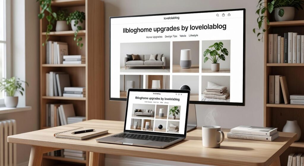
The llbloghome upgrades by lovelolablog are live right now. Everything you asked for is here.
I didn’t guess at what would work better. I took your feedback and used it as the blueprint. Every change you’re about to see came directly from what you told me wasn’t working.
This post walks you through the new I’ll show you where everything is now and how to find exactly what you’re looking for faster than before.
No more hunting through pages. No more getting lost trying to find that space-saving hack you saw last week.
Just a cleaner way to explore the concepts and inspiration that make your space feel like home.
A Fresh Look: The Philosophy Behind Our New Design
I’ll be honest with you.
I used to think design changes were just surface stuff. You pick some colors, move a few buttons around, and call it a day.
Then I spent three months staring at our old site and realized something. The design was fighting against everything we talked about in our articles.
We write about creating calm spaces. About making your home feel like a refuge. But our site? It was cluttered and cold. The colors felt sterile and the fonts screamed at you from every corner.
That disconnect bothered me more than it should have.
So we started over. Not with trends or what other sites were doing. We asked ourselves what a cozy digital space actually feels like.
The answer came down to warmth and breathing room.
You’ll notice the color palette now leans into softer tones. Creams and warm neutrals instead of stark whites. We switched to gentler fonts that don’t demand your attention. And the images? We made them bigger and more immersive because sometimes you just need to get lost in a beautiful space.
Some people might say this is just aesthetics. That content is all that matters.
But here’s what I’ve learned. Design shapes how you feel when you’re here. A chaotic layout creates mental noise even when the words are good.
The llbloghome upgrades by lovelolablog weren’t about following some minimalist trend. They were about building a place that actually practices what we preach.
Think of it this way. You wouldn’t write about cozy living from a cramped, fluorescent-lit office. The environment matters.
We wanted to strip away the distractions. Create a cleaner canvas where the ideas can actually land without competing with busy backgrounds or aggressive design choices. In our pursuit of a more focused gaming experience, we decided to embrace the ethos of Llbloghome, crafting a space that allows creativity to flourish without the clutter of overwhelming visuals or intricate designs. In the spirit of creating an immersive and distraction-free gaming environment, we found inspiration in the principles of Llbloghome, enabling us to cultivate a serene space where creativity can flourish without the noise of overwhelming designs.
Because when you come here looking for inspiration, you shouldn’t have to fight through visual clutter to find it.
Finding Your Way: Effortless Navigation and Discovery
You know that feeling when you land on a website and can’t find what you’re looking for?
I’ve been there. You click around for five minutes and end up more confused than when you started.
That’s exactly what I wanted to fix with the Llbloghome upgrades by lovelolablog.
Some people say complicated menus give you more options. They argue that having everything visible means nothing gets missed. And sure, I see where they’re coming from.
But here’s what actually happens.
You get overwhelmed. You click away. You never find that perfect space-saving hack you were searching for.
So I rebuilt the whole thing from scratch.
The New Menu Structure
The top menu is now clean and simple. I organized everything into categories that actually make sense when you’re looking for home design ideas.
You’ll find sections like Cozy Living Concepts and Personalized Aesthetics right where you expect them. No more hunting through random dropdowns.
And if you’re working with a small apartment? Space-Saving Hacks has its own spot now.
Search That Actually Works
The search bar now predicts what you’re typing. Start entering “small bedroom” and it’ll show you relevant articles before you finish.
It’s fast. It’s accurate. And honestly, it should’ve been this way from the beginning.
Where First-Time Visitors Should Start
Look, I know llbloghome has hundreds of articles now. That’s great for regulars but confusing if you’re new.
That’s why I added a Start Here section right on the It shows you our most popular content and the foundational pieces that’ll give you the best overview of what we do.
Think of it as your entry point. The stuff I wish I could personally hand to every new reader.
The Curious Insights Category
This one’s my favorite addition.
Not everything about home design fits into neat categories. Sometimes you stumble across an idea that’s just different. Unexpected. The kind of thing that makes you rethink your entire living room.
That’s what Curious Insights is for. It’s where I put the unconventional stories and surprising design approaches that don’t fit anywhere else.
My recommendation? Start with the new menu if you know what you want. Use the search bar if you’re looking for something specific. And if you’re just browsing? Check out Curious Insights. You might find something you didn’t even know you needed.
The Inspiration Hub: How to Use the New Homepage Layout
You land on the homepage and something feels different. I tackle the specifics of this in Llbloghome Upgrade Tips and Tricks.
The whole thing got a makeover. And honestly, I think you’re going to like where this is headed.
Let me walk you through what’s new.
The Featured Story banner sits right at the top. It’s the first thing you see when you visit. I put our most compelling piece there because it deserves your attention. Think of it as the story I’m most excited about right now. As you dive into our Featured Story banner, don’t miss the fascinating insights on “Upgrade Tricks Llbloghome,” which are sure to elevate your gaming experience to new heights. As you dive into our Featured Story banner, don’t miss the fascinating insights on the latest game mechanics, including essential Upgrade Tricks Llbloghome that can elevate your gameplay experience to new heights.
Scroll down a bit and you’ll hit the Latest Posts grid.
This is where fresh content lives. New ideas about cozy living, space-saving tricks, design concepts I just discovered. If you want to know what’s happening right now at llbloghome upgrades by lovelolablog, this is your spot.
But here’s what I’m really proud of.
The Most Popular This Month section changes everything. You know those posts you somehow missed three weeks ago? The ones everyone keeps talking about? They show up here. It’s like having a friend who says “hey, you really need to read this.”
Now, some people might say a simple blog list works just fine. Why complicate things with all these sections?
Fair point. But here’s what they’re missing.
You don’t always want the newest post. Sometimes you want the best post. Or the one that speaks to what you’re dealing with right now. That’s why I built these different content blocks.
Between you and me, I’m betting this layout will get smarter over time. Right now it shows what’s popular and what’s new. But I can see it learning what resonates with you specifically. (That’s speculation on my part, but the bones are there.)
Pro tip: Don’t just click the first thing you see. Scroll through the entire page at least once. You’ll notice how different types of inspiration are organized now. The hack llbloghome approach means everything has its place.
Makes browsing feel less like work and more like discovery.
More Than a Blog: New Ways to Connect and Interact
Your living room isn’t the only thing getting an upgrade.
I’ve been watching how people interact with home design content, and honestly? The old comment box at the bottom of a post isn’t cutting it anymore.
So we changed things.
A Comments Section That Actually Works
You know how most blog comments feel like shouting into a void? We fixed that. The new setup makes it easier to reply to specific people and follow conversations that matter to you.
I think this is where things get interesting. We’re moving toward something that feels less like a blog and more like a community space where you can share your own upgrade tricks llbloghome style.
Here’s what I’m betting happens next. More of you will start sharing photos of your own spaces. Not just commenting, but showing what you’ve done with the ideas you find here. Upgrade for Llbloghome Park-Explore picks up right where this leaves off.
The newsletter signup is right there now when you need it (not hidden three clicks deep). Subscribers get the stuff I don’t post publicly. Room makeovers before anyone else sees them. Early access to space-saving ideas I’m testing.
And the Community Favorites section? That pulls in what’s trending from our social channels. If everyone’s talking about a cozy corner setup on Instagram, you’ll see it here too.
I’m speculating a bit, but I think we’re headed toward a place where the line between blog and community just disappears. You come for an idea, stay for the conversation, and leave with something you can actually use in your home. As we embrace this evolution in gaming culture, the innovative concept of “Hack Llbloghome” exemplifies how players can transform insights from discussions into tangible enhancements for their own gaming spaces. As we navigate this transformative landscape of gaming culture, the emergence of platforms like Hack Llbloghome exemplifies how community-driven insights can seamlessly blend with practical applications for enhancing our gaming experiences at home.
That’s the goal anyway.
Your Cozy Corner of the Internet, Reimagined
You came here looking for a better way to find home inspiration.
You’ve got it now. This is your complete map to our newly upgraded digital home.
I know how frustrating endless scrolling can be. You’re looking for ideas that actually fit your space and style, but you end up sifting through content that doesn’t speak to you.
We’ve replaced that chaos with intentional discovery.
Every change we made had one goal: to bring you personalized home inspiration more beautifully and efficiently. The new layout guides you to what matters. The search works the way you think. The categories make sense.
It’s designed for how you actually use it.
Go explore the new homepage and see what we’ve built. Try the llbloghome upgrades by lovelolablog and let us know what you think.
Your cozy corner just got cozier.