Choosing the right colors for your home isn’t just about style — it’s about how you want to feel every day. If you’re searching for ways to create a space that feels calmer, cozier, or more energizing, understanding color choices at home psychology can completely transform how you approach design.
This article explores how different hues influence mood, productivity, and comfort, helping you make intentional decisions that reflect your personality and lifestyle. From soothing neutrals that promote relaxation to bold tones that spark creativity, we break down what actually works — and why.
Our insights are grounded in established interior design principles and behavioral research on how environments impact emotions. By combining practical design experience with psychological understanding, we provide guidance you can confidently apply in any room, whether you’re refreshing a small corner or reimagining your entire home.
More Than Just Paint
Your home’s color palette is more than decoration; it quietly steers mood, focus, and even sleep quality. Studies from the University of Texas found that bland gray, beige, and white interiors were linked to higher feelings of sadness and depression. Meanwhile, research in color psychology shows blue environments can lower heart rate and reduce stress. Yet with endless swatches, many homeowners freeze or pick a shade that feels off. Understanding color choices at home psychology principles changes that. By applying proven design frameworks, you can intentionally craft energy, warmth, or calm turning rooms into a sanctuary.
Color psychology is the study of how hues influence human emotion and behavior. In simple terms, different wavelengths of light stimulate the brain in distinct ways, triggering physical and emotional responses. Think of it like a soundtrack for your walls; the tone shifts how you feel the moment you enter a room.
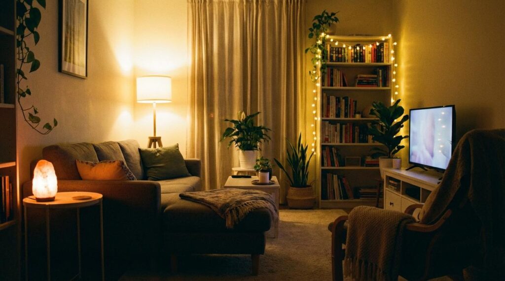
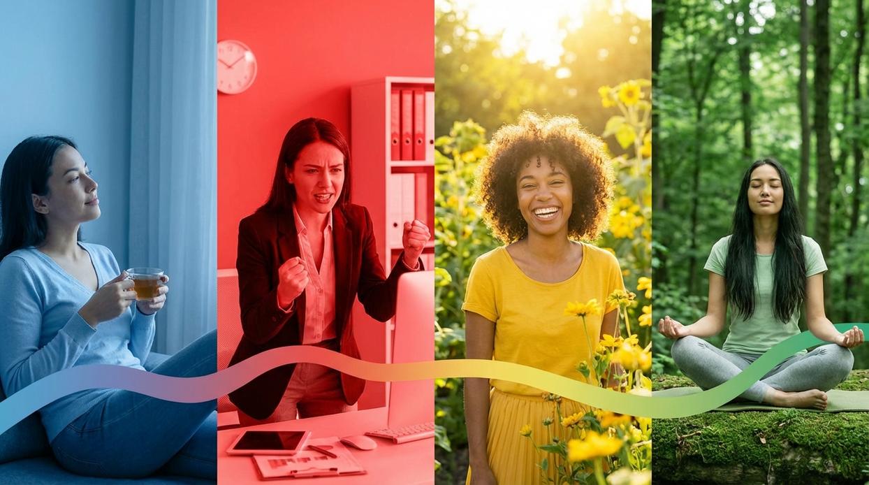
Designers usually group shades into two main families: warm and cool. Warm colors—reds, oranges, and yellows—contain longer wavelengths. They are linked to energy, appetite, and social connection. Restaurants often use red because studies suggest it can increase heart rate and stimulate hunger (University of Rochester research). In homes, warm tones make large rooms feel cozier and more intimate.
Cool colors—blues, greens, and purples—have shorter wavelengths and are associated with calm and focus. Hospitals frequently favor soft blues to promote relaxation. These hues visually recede, meaning they can make compact spaces appear larger and airier.
Neutrals such as grays, beiges, and whites act as the balancing backdrop. They provide visual rest and allow accent shades to shine without overwhelming the senses.
Understanding color choices at home psychology helps you create rooms that support your mood, not sabotage it. Balance is the quiet hero of every successful palette at home.
Designing for Energy and Connection: The Warm Palette
Warm colors are hues that visually “advance,” meaning they feel closer and more stimulating than cooler tones. In color choices at home psychology, these shades are linked to activity, sociability, and emotional warmth (Elliot & Maier, 2014). Let’s break down what that actually means for your home.
-
Red: Often associated with passion and appetite stimulation (hence its popularity in restaurant branding). It works beautifully as an accent in dining rooms or living areas where conversation flows. In bedrooms, however, it can feel overstimulating (great for a rom-com set, less ideal for sleep).
-
Orange: A blend of red’s energy and yellow’s cheerfulness. It encourages creativity and enthusiasm, making it a smart pick for home offices, studios, or playrooms.
-
Yellow: Linked to optimism and mental clarity. Soft buttery tones brighten kitchens and breakfast nooks. But overly saturated yellows may increase feelings of agitation in some people (Küller et al., 2009).
Actionable Cozy Living Tip: Instead of painting every wall, integrate warmth through:
- Textiles like rust-toned throws or golden cushions
- Framed art with warm undertones
- One intentional accent wall
If you’re unsure how placement affects energy, explore how room layout influences productivity and mood before committing. (Paint is easy to apply—harder to emotionally ignore.)
Crafting a Sanctuary: The Cool Palette
When I told a client we were redesigning her bedroom in blue, she hesitated. “Won’t it feel cold?” she asked. Not if you understand color choices at home psychology.
Blue is often associated with calm, trust, and productivity. Research from the University of Sussex found people reported feeling more relaxed in blue environments (Küller et al., 2009). That’s why designers recommend it for bedrooms to support better sleep, bathrooms for a spa-like reset, and offices where focus matters (yes, even during back-to-back Zoom calls). As one homeowner told me after repainting, “It feels like my brain can finally exhale.”
Green, considered the most restful color for the human eye, mirrors nature’s balance. “It’s like bringing the park indoors,” a client laughed after choosing sage for her living room. Use it in shared spaces or bedrooms to create a restorative retreat.
Purple carries a whisper of luxury and creativity. Lavender soothes; deep eggplant adds drama without shouting (think understated royalty, not costume party).
- Pro tip: Pale blues and greens visually push walls back, making small rooms feel more open and breathable.
Sometimes the right shade doesn’t just change a room—it changes how you feel inside it.
The Unsung Heroes: How Neutrals and Light Define a Room
Neutrals often get dismissed as the “safe” route. But in well-designed homes—from sun-drenched Arizona ranches to compact Brooklyn brownstones—they’re the quiet power players.
White signals purity and simplicity. In a coastal California bungalow, it can feel breezy and expansive. But without texture—think raw oak beams, linen drapes, or matte ceramic—it risks feeling clinical (like a showroom no one actually lives in).
Gray is balance embodied. Warm grays (greige, in designer speak) suit traditional spaces with brass fixtures, while cool grays complement industrial lofts with steel accents. It’s a chameleon foundation that adapts to nearly any style.
Beige and Taupe bring grounded warmth. Popular in mountain homes and suburban family spaces alike, they create comfort without visual noise. These hues are central to color choices at home psychology, subtly encouraging relaxation and connection.
• Always test swatches on multiple walls.
• Observe them morning, noon, and night.
Light changes everything. Northern exposure casts cooler tones; southern light intensifies warmth. Warm LED bulbs can make gray look beige, while cool lighting can flatten taupe entirely. Designers call this “undertone shift,” and it’s why paint chips lie.
Pro tip: Paint large sample boards and move them around before committing.
Your Home, Your Palette, Your Well-Being
You’re no longer guessing—you’re choosing with intention. Color selection anxiety happens when trends shout louder than your instincts. But understanding color choices at home psychology gives you a calmer, clearer path forward. Instead of asking, “Is this popular?” you can ask, “How do I want to feel here?”
That shift is powerful. Your home becomes more than stylish—it becomes supportive of your mental and emotional well-being.
- Start small: paint a test swatch and live with it for a few days.
Notice it in morning light, evening shadows, and everyday moments. The perfect color isn’t trendy—it’s the one that feels right to you.
Create a Home That Feels as Good as It Looks
You came here looking for clarity on how to transform your space into something more intentional, comforting, and uniquely yours. Now you understand how layout, lighting, textures, storage solutions, and especially color choices at home psychology shape the way your home feels every single day.
If you’ve ever felt that your space was “off,” cluttered, or missing warmth, that frustration makes sense. A home that doesn’t reflect you can quietly drain your energy. The good news? Small, thoughtful changes can completely shift the atmosphere without requiring a full renovation.
Start with one room. Adjust your palette. Rework a tight corner with a smarter storage hack. Layer in textures that invite comfort. Take action today instead of letting your space stay stuck in “almost right.”
If you’re ready to finally love walking into your home every day, explore more cozy living ideas and space-saving inspirations designed to make your space feel intentional, balanced, and beautifully you. Don’t settle for a home that just looks good—create one that truly feels right.