I’ve seen too many good blogs die because they load like molasses.
You’re probably here because your blog feels slow or your visitors bounce before they even see your best work. That’s frustrating when you’ve put real effort into your content.
Here’s the thing: speed matters. So does how your blog feels when someone lands on it. A clunky experience kills engagement faster than bad writing ever could.
I built this checklist after watching countless blogs struggle with the same issues. Slow load times. Poor navigation. Design that pushes readers away instead of pulling them in.
This guide walks you through the upgrade tip llbloghome needs to go from sluggish to smooth. Technical fixes that actually work. Design tweaks that keep people reading. Simple changes that make a real difference.
At Llbloghome, we focus on creating spaces that feel good to be in. That applies to digital spaces too. Your blog should invite people to stay, not make them want to leave.
You’ll get a clear roadmap here. No complicated jargon. Just practical steps to make your blog faster and more engaging.
Your message deserves to reach people. Let’s make sure your blog isn’t the thing standing in the way.
The Need for Speed: Technical Performance Boosts
Your site is slow.
I know because most sites are. And if you’re running a blog about home design and cozy spaces, the last thing you want is visitors staring at a loading screen instead of your beautiful room layouts.
Speed matters. Google says 53% of mobile users leave sites that take longer than three seconds to load. That’s half your audience gone before they even see your first image.
Let me walk you through what actually works.
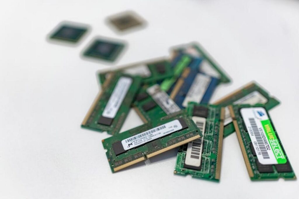
Optimize Your Images: The #1 Performance Killer
This is where most bloggers mess up (myself included for way too long).
You take a gorgeous photo of your living room setup. It’s 4MB straight from your phone. You upload it directly to your site. And boom. Your page now crawls.
Here’s what I do instead. I compress every image before it goes live. Tools like TinyPNG or ShortPixel can cut file sizes by 70% without visible quality loss.
Then there’s WebP format. It’s newer and smaller than JPEG. Most modern browsers support it now, though I’ll admit the adoption isn’t 100% yet.
And lazy loading? That just means images only load when someone scrolls down to see them. Why load 20 images if someone only views the first three?
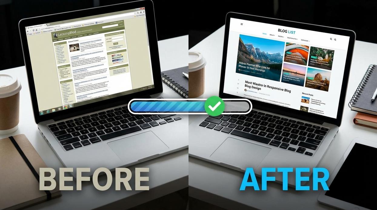
Choose a Lightweight Theme: Not All Designs Are Equal
I see this all the time. Someone picks a theme because it looks amazing in the demo. It has sliders and animations and 47 different layout options.
Then their site takes eight seconds to load.
Bloated themes kill performance. All those features you’ll never use? They’re still loading code in the background.
I’m not saying pick an ugly theme. Just pick one built for speed first and looks second. Upgrade tip llbloghome: test your theme’s performance before committing.
Leverage Caching: Your Secret Weapon for Speed
Caching sounds technical but it’s simple.
When someone visits your site, their browser saves parts of it on their device. Next time they come back, the browser doesn’t need to download everything again. It just grabs what’s already stored.
This makes repeat visits way faster. We’re talking seconds shaved off load times.
Most caching plugins set this up automatically. I won’t lie though. Sometimes caching causes weird issues where updates don’t show immediately. It’s a tradeoff worth making.
Conduct a Plugin Audit: Digital Decluttering
Every plugin adds weight to your site.
I get it. Plugins solve problems fast. You need a contact form so you install a plugin. You want social sharing buttons so you add another one. Before you know it you’ve got 30 plugins running.
Here’s what I do quarterly. I go through every single plugin and ask: do I actually use this?
If the answer is no or I’m not sure, it gets deactivated. I wait a week to see if anything breaks. If nothing does, I delete it completely.
You’d be surprised how many plugins you installed once and forgot about. They’re just sitting there slowing everything down.
Beyond Speed: Crafting an Inviting User Experience
Speed matters. We covered that.
But here’s what most people get wrong. They think a fast site automatically means a good user experience.
It doesn’t.
I’ve seen plenty of blogs that load in under a second but still feel terrible to use. Confusing menus. Walls of text. Designs that look like they’re from 2009. While speed is important, a site like Llbloghome reminds us that a seamless user experience is equally crucial, as confusing layouts and outdated designs can ruin even the fastest loading times. In a sea of fast-loading but frustrating websites, Llbloghome stands out by prioritizing user-friendly design alongside speed, proving that a seamless experience is essential for keeping gamers engaged.
You can have the fastest site in the world, but if people can’t find what they need or your content hurts their eyes? They’re gone.
Let me break down what actually makes a blog feel inviting.
Simplify Your Navigation
Your menu is a roadmap.
If I land on your site and can’t figure out where to go in three seconds, I’m leaving. That’s just how it works.
Keep your main menu simple. Five to seven items max. Use clear labels that tell me exactly what I’ll find when I click.
No clever wordplay. No vague categories. Just straightforward navigation that gets me where I need to go.
Think about it like a grocery store. You don’t want to wander around looking for milk. You want clear signs that point you straight to the dairy section.
Improve On-Page Readability
Nobody wants to read a wall of text.
I mean it. When I see a giant block of words with no breaks, I scroll right past it. Doesn’t matter how good the content might be.
Here’s what works:
• Short paragraphs (two to four sentences)
• Clear headings that break up sections
• Bullet points for lists
• White space between ideas
Your content needs room to breathe. Give readers’ eyes a break between thoughts.
And here’s something most people miss. Your font size matters more than you think. If I have to squint or zoom in to read your text on my phone, I’m not sticking around.
Prioritize Mobile-First Design
Most of your readers are on their phones right now.
Not some. Most.
Google reports that over 60% of searches happen on mobile devices. If your blog looks great on desktop but terrible on a phone, you’re losing more than half your potential audience.
Upgrade Tip llbloghome: Test your site on your actual phone before you publish anything. What looks fine on your computer screen might be unreadable on a smaller display.
Your text should be easy to read without zooming. Buttons need to be big enough to tap without hitting the wrong thing. Images should resize properly.
It’s not about making a mobile version of your desktop site. It’s about designing for mobile first, then scaling up.
Develop a Cohesive Aesthetic
Your design tells people whether to trust you.
I know that sounds superficial, but it’s true. A blog with mismatched fonts, clashing colors, and random image styles looks unprofessional. Even if your content is solid. If this resonates with you, I dig deeper into it in House Hacks Llbloghome.
Pick two or three fonts and stick with them. Choose a color palette that doesn’t make people’s eyes hurt. Use images that have a consistent style or filter.
This doesn’t mean everything needs to look identical. It means everything should feel like it belongs together.
When someone visits llbloghome, they should immediately get a sense of your style. That consistency builds recognition and keeps people engaged longer.
Because at the end of the day, user experience isn’t about fancy tricks or complex design. It’s about making it easy for people to find what they need and enjoy reading it when they do.
Smarter Content: Upgrading Your SEO and Engagement
You’ve got content sitting on your site right now that could be doing way more for you.
I’m talking about posts you wrote months or even years ago. They ranked well once. Maybe they still get a trickle of traffic. But they’re just sitting there, slowly losing ground to newer articles.
Here’s what most bloggers miss. They keep cranking out new posts while their best work collects dust.
Some people say you should always focus on fresh content. That Google rewards new stuff over old. And sure, publishing regularly matters.
But here’s the reality.
Refreshing your existing content often beats starting from scratch. I’ve seen posts jump from page three to page one just by updating stats and adding better internal links.
Start with your analytics. Find posts that get decent traffic but haven’t been touched in over a year. Those are your goldmine. Update the intro, swap out old data, and add links to newer related posts you’ve written since then.
Speaking of links, most people treat internal linking like an afterthought. They’ll drop one or two links and call it done.
That’s leaving money on the table.
When you link between your own posts, you’re building a map. Not just for readers but for search engines trying to figure out what you’re actually about. I aim for three to five relevant internal links per post (not random ones, ones that actually help).
Here’s something I noticed that nobody talks about. The placement of those links matters more than the number. A link in your first two paragraphs carries more weight than five links buried at the bottom.
Now let’s talk about search intent. You’ve probably heard this term thrown around. But what does it actually mean for your home design blog?
Say someone searches “small bedroom storage ideas.” They’re not looking for a 3,000-word history of furniture. They want solutions they can use this weekend. Photos help. Step-by-step instructions help more. For gamers looking to enhance their setup without breaking the bank, exploring the Llbloghome Upgrade Tips and Tricks can provide practical solutions that transform a small space into an efficient gaming haven this weekend. For gamers looking to elevate their gaming experience on a budget, the Llbloghome Upgrade Tips and Tricks offer practical solutions that can be implemented in a weekend, transforming even the coziest of setups into a more functional and enjoyable space.
I see too many bloggers stuff keywords into posts without asking what the reader actually needs. That’s backwards. Answer the real question first. Then worry about where your keywords fit.
Here’s an upgrade tip llbloghome I use: before writing anything, I type my target keyword into Google and study the top five results. What are they covering? More important, what are they missing?
That gap is your opportunity.
Maybe everyone’s showing the same IKEA hacks but nobody’s addressing renters who can’t drill holes. Or perhaps they’re all focused on modern aesthetics when some readers want cozy, traditional solutions.
Find what’s missing and own it.
One more thing that makes a real difference. Your comment section isn’t just for collecting spam (though you’ll get plenty of that).
When readers leave thoughtful comments and you respond, search engines notice. It signals that your content sparked something. That people care enough to engage.
End your posts with a real question. Not “What do you think?” That’s lazy. Ask something specific about their own space or challenge. “What’s the weirdest spot you’ve turned into storage?” gets responses. Generic questions get crickets.
Make commenting easy too. If someone has to create an account or jump through five verification hoops, they won’t bother. I cover this topic extensively in Llbloghome Upgrade Hack.
I’ve watched posts with active comment sections outrank similar posts with better backlinks. Engagement matters more than most people realize.
Look, you don’t need to overhaul everything at once. Pick three older posts this month. Update them. Add better internal links. Make sure they actually answer what people are searching for.
Check out upgrade for llbloghome park explore to see how small changes can transform your space and your content strategy.
Then watch what happens to your traffic.
Measure to Improve: Key Performance Metrics to Track
You can’t fix what you don’t measure.
I learned this the hard way when I spent months creating content that I thought was great. Turns out, people were leaving my site within seconds.
The data doesn’t lie. And once you know what to track, you can actually make your site better.
Core Web Vitals: Your Technical Report Card
Google cares about three things here. Largest Contentful Paint (LCP) measures how fast your main content loads. First Input Delay (FID) tracks how quickly your page responds when someone clicks something. Cumulative Layout Shift (CLS) catches those annoying moments when text jumps around while you’re trying to read.
Run your site through Google PageSpeed Insights. It’s free and tells you exactly where you stand.
According to Google’s own research, sites that meet Core Web Vitals thresholds see 24% less abandonment (that’s people who just give up and leave).
User Behavior Metrics: Are People Actually Staying?
Time on page tells you if your content holds attention. Bounce rate shows how many visitors leave without clicking anything else.
Here’s what matters. If someone spends three minutes reading your article about upgrade tip llbloghome strategies, that’s a win. If they land and bounce in five seconds? Something’s wrong.
A 2023 Contentsquare study found that pages with average session times over two minutes convert 3x better than those under 30 seconds.
Lower bounce rates mean you’re giving people what they came for.
Top Performing Pages: Double Down on What Works
Open Google Analytics. Check which articles get the most traffic.
Then create more of that.
I found one of my llbloghome upgrade tips and tricks posts was getting 10x the views of everything else. So I wrote five more in that style.
Traffic doubled in six weeks.
I get it. Your blog isn’t performing the way you want.
Maybe it loads too slow. Maybe readers bounce before they even scroll. Maybe you’re putting in the work but not seeing results.
I’ve been there.
The good news is that fixing your blog doesn’t require a complete overhaul. You just need the right approach.
This guide gives you a clear strategy to upgrade tip llbloghome and turn your blog into something that actually works. We’re talking faster load times, better engagement, and readers who stick around.
I’m covering the technical stuff that matters. The design choices that keep people reading. The content moves that make a difference.
You came here looking for ways to improve your blog. Now you have them.
A slow blog kills your chances before you even start. But when you fix the speed issues and make your content more engaging, you remove that barrier completely. To truly captivate your audience and enhance their experience, it’s essential to implement an Upgrade for Llbloghome Park-Explore that optimizes both speed and engagement, effectively eliminating the barriers that slow blogs often create. To enhance user engagement and remove barriers to entry, it’s crucial to implement an Upgrade for Llbloghome Park-Explore that optimizes both speed and content quality.
Start Small and Build Momentum
Don’t try to do everything at once.
Pick one thing from this guide. Compress five images. Update one old post. Fix a single technical issue.
Do that today.
Small upgrades add up fast. Consistency beats perfection every time.
Your blog can be better. You just have to take the first step.