Ever walk into a room and feel calm or agitated, but can’t pin down why? That’s the power of color. Most people pick wall colors based on what’s trendy.
But here’s the thing: those choices might be messing with your mood, sleep, and energy levels. Interior colors psychology isn’t just a buzzword; it’s real. I’ve seen it firsthand. Change a shade, change the vibe of the whole room.
It’s like magic. But real.
Why trust this? Because I’ve spent years diving into how spaces affect us. I’m offering more than generic tips.
You’ll get a practical guide to using color psychology to feel genuinely good at home. Forget trends. Let’s talk about what truly works for you.
Ready to explore? You’re in the right place.
The Gentle Science: Color Psychology in Your Space
Let’s talk about interior colors psychology. Have you ever walked into a room and just felt it? Colors speak a language our brains understand instinctively.
They whisper (or shout) in ways we can’t always put into words. Let’s break it down.
Warm colors. Reds, oranges, and yellows. These scream energy and warmth.
They invite social connection like a good friend does. Think of a summer barbecue or a cozy campfire. These hues make a room feel alive and lively.
But be careful. Too much can overwhelm. It’s like having too much caffeine.
A little goes a long way.
Now, let’s chill with the cool colors. Blues, greens, and purples. These are all about calmness, focus, and making a space feel larger.
Picture a serene beach or a quiet forest. They’re perfect for bedrooms or offices. But even they can feel cold if overdone.
Balance is key.
And light. It . Natural daylight can make a paint color sing, while warm artificial light might coax a different note from the same shade.
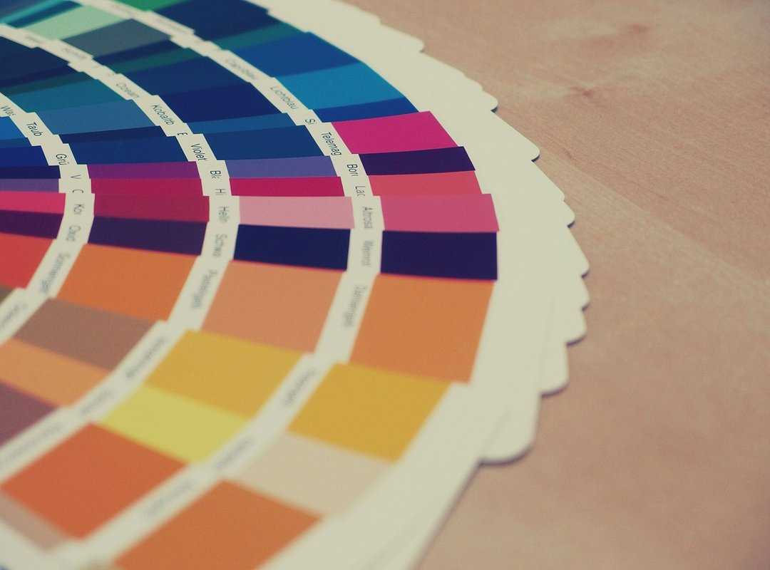
Always test a paint swatch on multiple walls. Observe it at different times of day. It’s your pro tip for avoiding regrets.
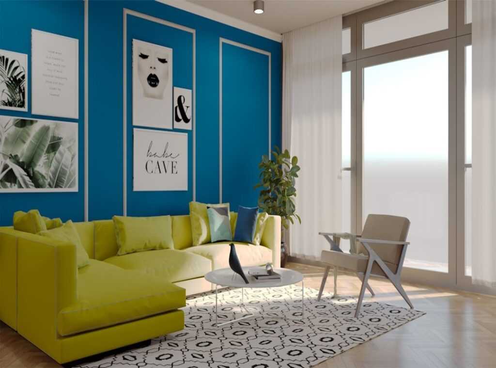
Saturation and tone matter too. A muted, earthy green is calming. A bright, zesty lime green?
Energizing. The shade is as important as the color itself.
Want more design secrets? You can learn more.
Colors aren’t just decoration. They’re a mood, an energy. They shape our spaces and our minds.
So, what’s your space saying to you?
Feel-Good Color Palette: Moods in Focus
When I think about interior colors, it’s all about mood. Yes, we can list colors until we’re blue in the face (pun intended), but what really matters is how they make us feel. Are you looking for calm and serenity?
Soft blues, sage, and olive greens can transport you to nature. Think sky, water, forests. Perfect for a bedroom or reading nook, these hues whisper “rest.”
But what if you’re after warmth and connection? Let’s dig into earthy tones like terracotta, warm taupe, and creamy whites. They’re grounding, almost like a gentle hug.
I love them in living rooms and entryways. It’s that comforting “come in, stay a while” vibe.
Feeling stuck? For creativity and joy, I say go for soft yellows, muted corals, and teal. These colors spark energy and happiness (ideal for a home office or craft room).
An accent wall in a kitchen? Brilliant! Imagine cooking dinner bathed in these cheerful tones.
Now, some of us crave sophistication without clutter. Enter complex neutrals. Ever heard of “greige” (a mix of gray and beige)?
It’s amazing. Pair it with charcoal or mushroom. These shades clear the stage for your thoughts.
No visual noise, just focus and clarity. Bedroom, office, or even a living space, they work anywhere.
Pro tip: Always consider the purpose of your room. What do you want to feel? If you’re curious about how hues affect moods, check out color psychology in interior design.
It’s a game changer.
So there it is. From serenity to energy, your color choices set the tone. And trust me, interior colors psychology isn’t just a fancy term.
It’s the secret sauce behind a truly personalized space.
Beyond the Swatch: Room Function Meets Color
Ever thought about how the colors in your home make you feel? It’s not just about personal taste. It’s tied to interior colors psychology.
Let’s break it down room by room.
First, the living room. This space is a social hub, right? So warm neutrals are your best friend here.
They create a cozy backdrop for conversation. But don’t keep it too bland. Throw in some lively pillows or bold art pieces to add a dash of personality.
You’ll thank me later when your guests start raving about your stylish space.
Now, let’s talk bedrooms. This is where you reboot. Soothing colors like navy or forest green help signal your brain that it’s time to relax.
They’re calming and perfect for winding down. Ever tried sleeping in a room with bright red walls? It’s like trying to nap during a rock concert.
Trust me, keep it chill.
The kitchen is a bit different. It’s the heart of the home where you want a clean, fresh vibe. Whites and grays work wonders for that neat look.
But don’t stop there. Introduce a warm color like soft yellow or terracotta to make it inviting. A kitchen that feels sterile isn’t going to inspire your inner chef.
Finally, the home office. You need colors that help you concentrate. Greens and blues are ideal for this.
They promote calm and focus, exactly what you need when you’re knee-deep in work. A splash of orange on a pinboard can spark creativity when you hit a wall. It’s like magic for your brain.
Curious about more on how color and art influence your space? Check out exploring connection art home. There’s always room to learn how to make your home feel truly yours.
Personalize Your Palette: Trust Your Instincts
Ever think about how interior colors psychology affects your space? It’s more personal than you might realize. I say, ditch the generic rules and start with your closet.
Seriously. The colors you love to wear probably make you feel good at home too. They’re like a comfort blanket for your soul.
Want to dig deeper? Create a digital mood board. Grab images of rooms, landscapes, or outfits you love.
Then, step back and see which colors keep popping up. It’s like a little treasure hunt for your taste (and who doesn’t love a good hunt?).
Here’s a pro tip: the 60-30-10 rule. It’s simple. Use 60% of a main color for your walls, 30% of a secondary color for furniture or textiles, and 10% for accent pieces.
This formula keeps your rooms balanced without the stress.
But , trust yourself. Your personal comfort beats any trend out there. So, if your gut says neon green, go for it!
Design is about creating a space where you feel you. Forget the trends. Your room, your rules.
Transform Your Space Into a Sanctuary
You’re ready now. With your new grasp of interior colors psychology, your home won’t just be a place you live. It’ll be where you thrive.
No more feeling out of place or subtly stressed by your surroundings. You can choose colors that fit your mood and function, creating a space that truly feels like you.
Feeling inspired? Dive into our gallery of cozy living concepts. See how these color principles come to life.
We’re here to help transform your space into a true sanctuary. Start browsing now and make your home a happier haven today.

 Connielanie Gibson writes the kind of everyday space-saving hacks content that people actually send to each other. Not because it's flashy or controversial, but because it's the sort of thing where you read it and immediately think of three people who need to see it. Connielanie has a talent for identifying the questions that a lot of people have but haven't quite figured out how to articulate yet — and then answering them properly.
They covers a lot of ground: Everyday Space-Saving Hacks, Curious Insights, Interior Design Inspirations and Layouts, and plenty of adjacent territory that doesn't always get treated with the same seriousness. The consistency across all of it is a certain kind of respect for the reader. Connielanie doesn't assume people are stupid, and they doesn't assume they know everything either. They writes for someone who is genuinely trying to figure something out — because that's usually who's actually reading. That assumption shapes everything from how they structures an explanation to how much background they includes before getting to the point.
Beyond the practical stuff, there's something in Connielanie's writing that reflects a real investment in the subject — not performed enthusiasm, but the kind of sustained interest that produces insight over time. They has been paying attention to everyday space-saving hacks long enough that they notices things a more casual observer would miss. That depth shows up in the work in ways that are hard to fake.